Sony's Action! Workshop for Co-Creating the Future
Sony's Employees Dismantling Each Other's Stereotypes: A Workshop Report from New Employees [Part 1]
27/01/2023
Unless we are mindful, we may find ourselves bound by our own stereotypes.
A product may be convenient for us, but what about others? Do the "convenient" features of Sony's products make them accessible for more people?
To cultivate employees who keep these points of view and questions in mind while developing products and services, Sony constantly hosts inclusive design workshops for its employees.
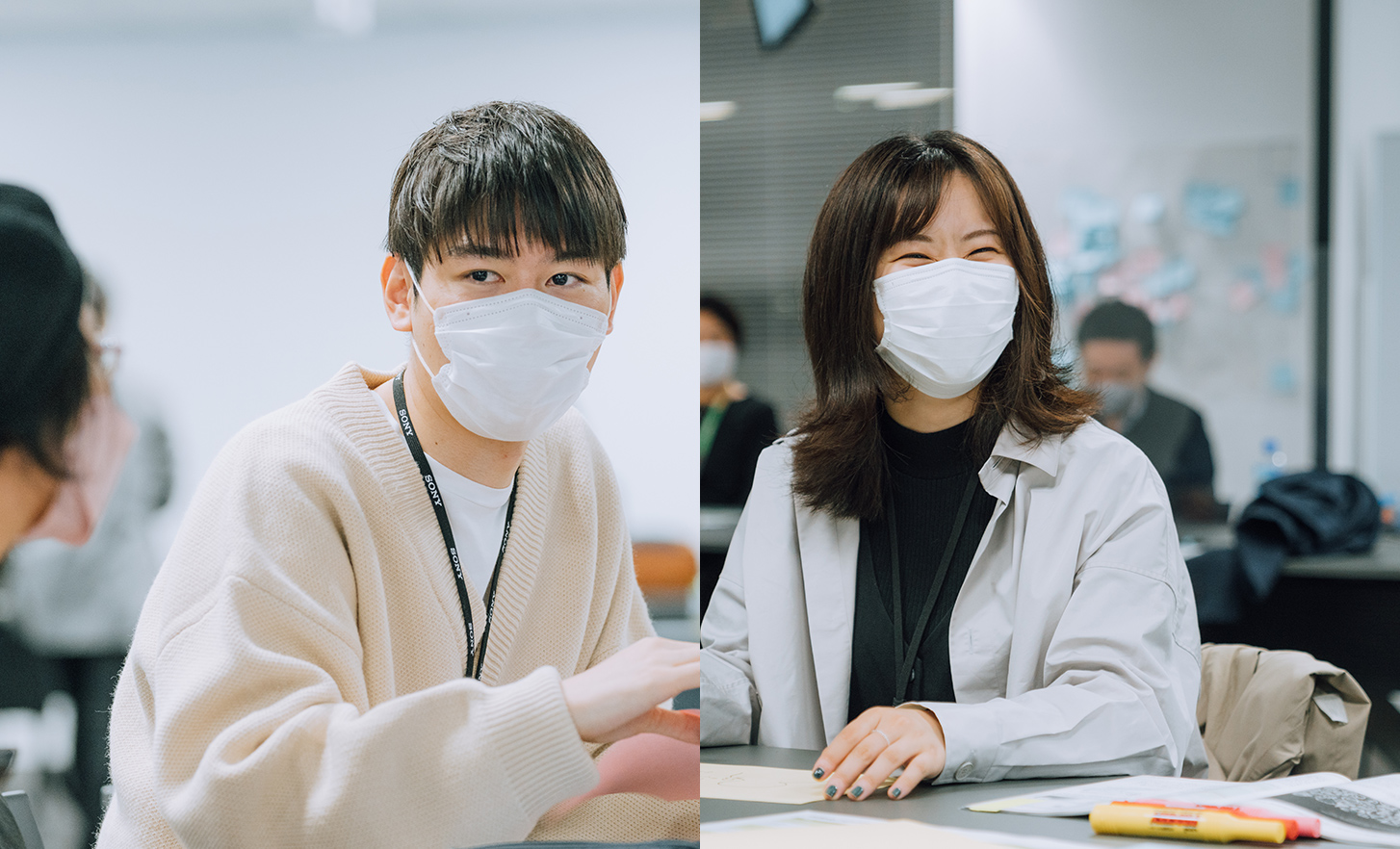
Here, we follow Sony's two new employees one day as they spend time with a lead user who is visually impaired.


Asking the questions!
Rin Ito


Asking the questions!
Rikushi Sabu


Providing the answers!
Hironori Sato
A closer look at inclusive design workshops at Sony
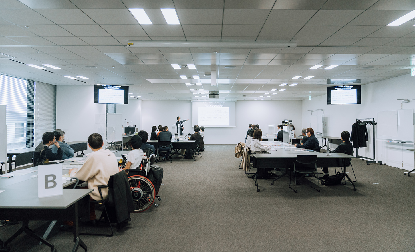
"Inclusive design" is an approach that obtains new insights into designs for all by ensuring that the needs of a wide range of users are understood and included.
This approach is taken at our inclusive design workshops, where people with visual, hearing, or other physical limitations are appointed as "lead users". The objective of the workshop is to gain insight from this thematic collaboration and discussion, and to abstractly frame new issues for society as a whole.
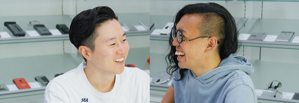
Joining us for this interview are Hironori Sato, a professional drummer who has visual impairment, and Sony's new employees Rin Ito and Rikushi Sabu. Rin had worked with Hironori at the workshop, while Rikushi worked with Maito Wakui who uses a wheelchair.
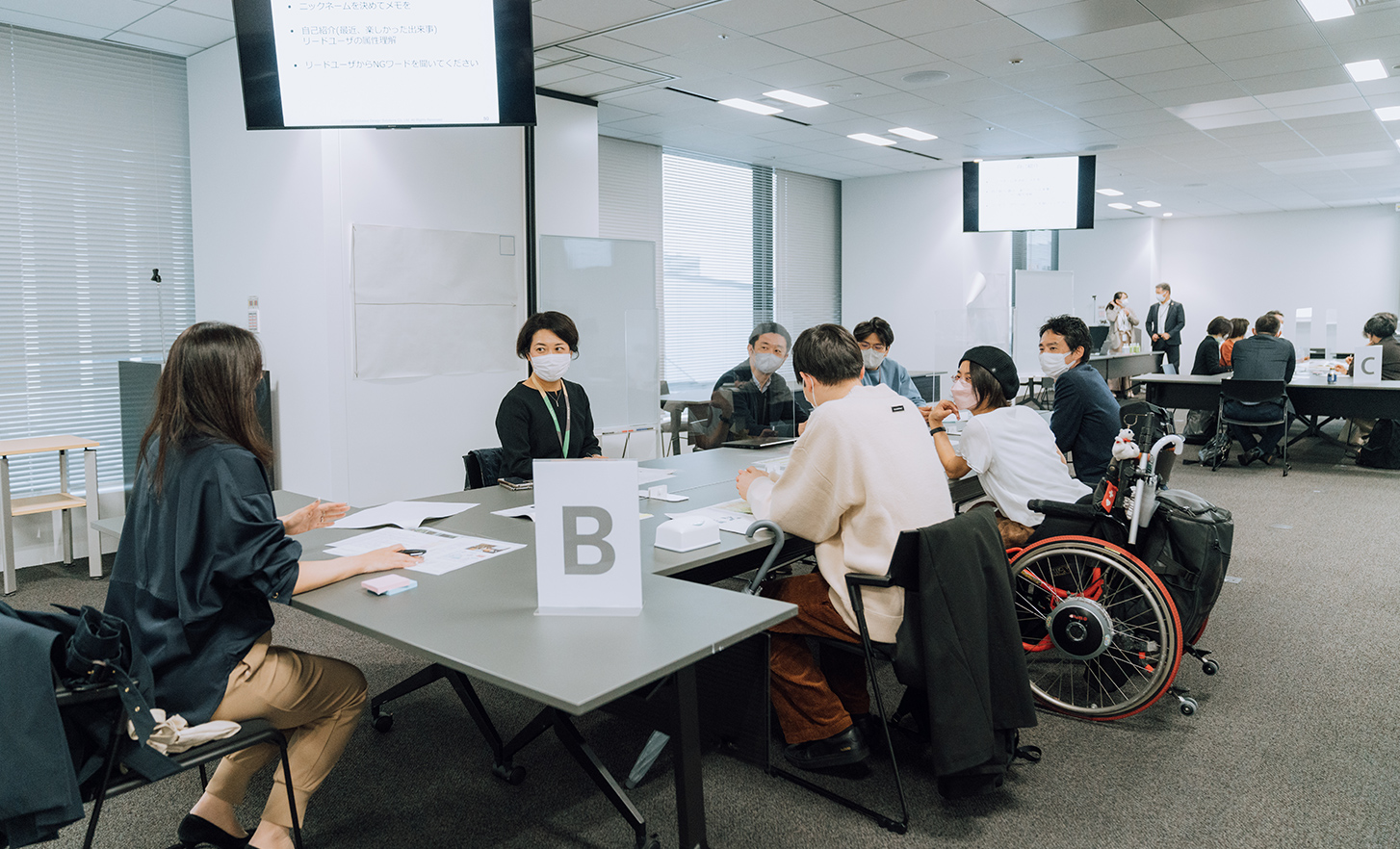
Each team with five to six members at inclusive design workshops includes one "lead user". To begin, we asked Hironori to define this role.
[Hironori]
To put it simply,
Lead users are those who experience certain things before everyone else will.
[Hironori]
Eventually we all experience physical limitations as we get older—difficulty seeing or walking, for instance—but some of us already live with these constraints, either from birth or at some point during our lives.
People with disabilities may know quite well about the kinds of problems that arise with old age. Older people themselves or those with disabilities who act as facilitators at the inclusive design workshops are called "lead users" because they help chart a course for the future.
As it's more effective to have diverse team members, the employees include varying age groups, genders and professional backgrounds.
Workshops begin with self-introductions by all team members, using nicknames. (Hironori goes by "Sato", Rin by "Rin", and Rikushi by "Sabu", which are used in the interview.)
Time to go out, but many inconveniences await, even if we are only venturing one train stop away
The workshop this day took on the theme of designing mobility for 2030 that everyone can enjoy. In the field, participants were to venture one train stop away from the Sony City Minatomirai office to the Minatomirai or Yokohama train station before returning to the office.
Team members had about an hour for this task and were asked to buy a drink from a vending machine if they had any extra time, although...
[Sato]
Usually there's only a few minutes left, but sometimes we run out of time. That's because it takes us out of familiar territory, into new areas.
Although there is not much time, other workshop participants are not allowed to assist the lead users. Instead, they were tasked with finding previously overlooked inconveniences that interfere with mobility. To do so, they would observe how lead users use transportation or services in an unfamiliar environment and ask them what was difficult.
Leaving the building itself presented the first hurdle. Large office buildings tend to be complex, which may make getting in and out unexpectedly time-consuming.
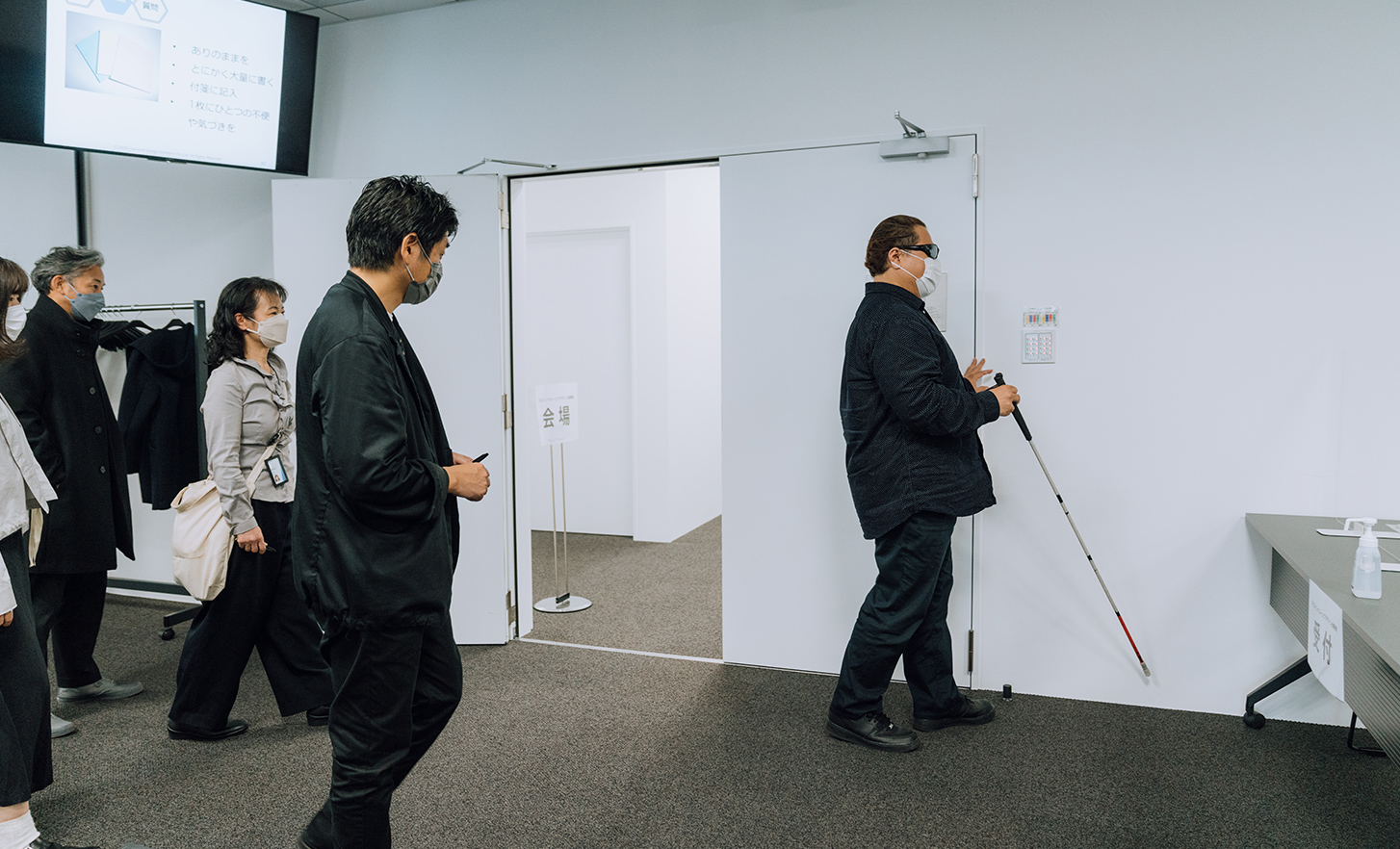
[Sony's employee]
Will it be hard to get to a lift?
[Sato]
(With a fearless grin) Well, let's go and find out!
Sato boarded a lift and reached the entrance surprisingly smoothly. He said he knew which way was out by recalling the way in, or by noticing passersby or the sound of the wind.
[Sato]
Great! That seemed to go very smoothly today—smooth enough to make you think it wasn't very inconvenient at all.
Once outside, they noticed Sato holding a smartphone. He says he often uses an urban walking navigation app that plays sounds to help him reach his destination.
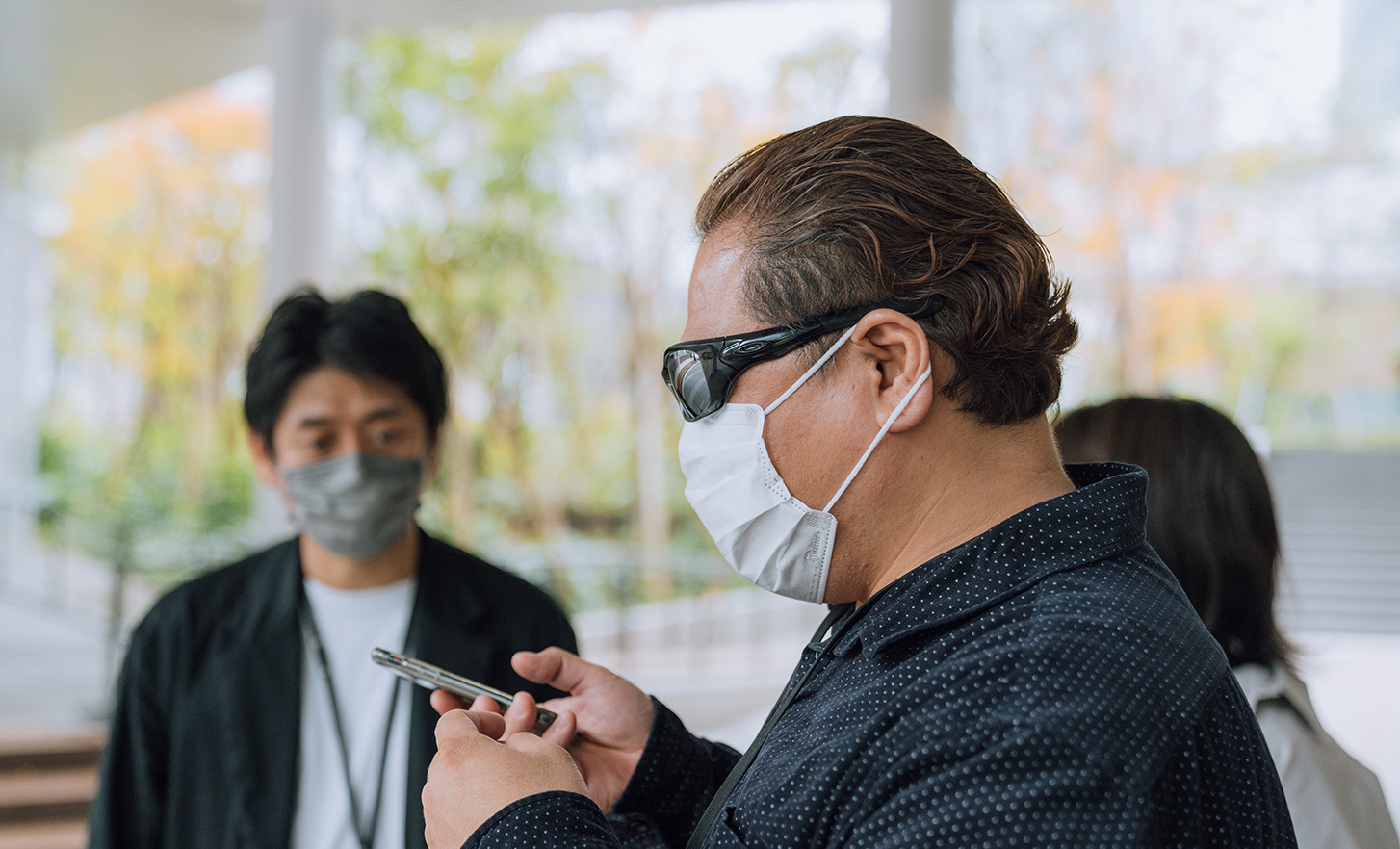
[Sato]
What's great about it is that the sounds tell you when your phone is pointed towards your destination. There—the pitch just got a little higher. It's signalling that the station is over there.
The nearest entrance to Shin-Takashima Station is not far from the building, so the team follows the tactile ground surface indicators.
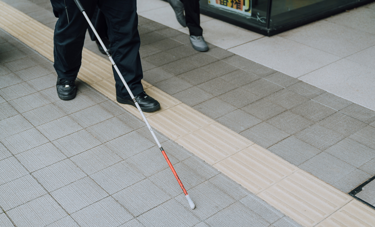
[Rin]
I imagine it makes quite a difference when there are indicators, but is that necessarily so?
[Sato]
Although I don't completely rely on them, it's reassuring to know they're there when needed. Experience tells me that following the indicators would be helpful—they'll lead me to station staff, for example.
The team had reached the ticket gate at the station. So far, the excursion had taken about 20 minutes.
[Sato]
Well, as long as we're here, I think I'll buy a ticket today.
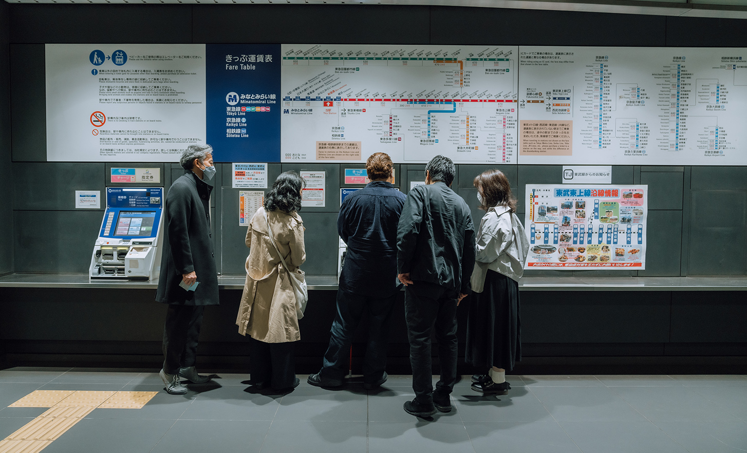
But as we will see later, this decision ended up taking more time than expected.
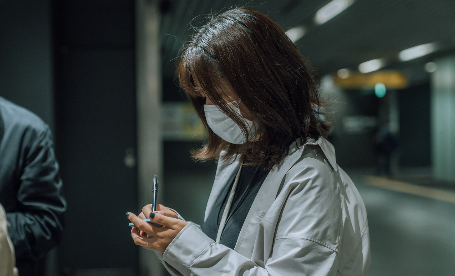
After Sony's employees notice things that seem to inconvenience Sato, they jot it down on a blue sticky note. But unless they ask him about it first, their own stereotypes may well lead them to the wrong conclusion.
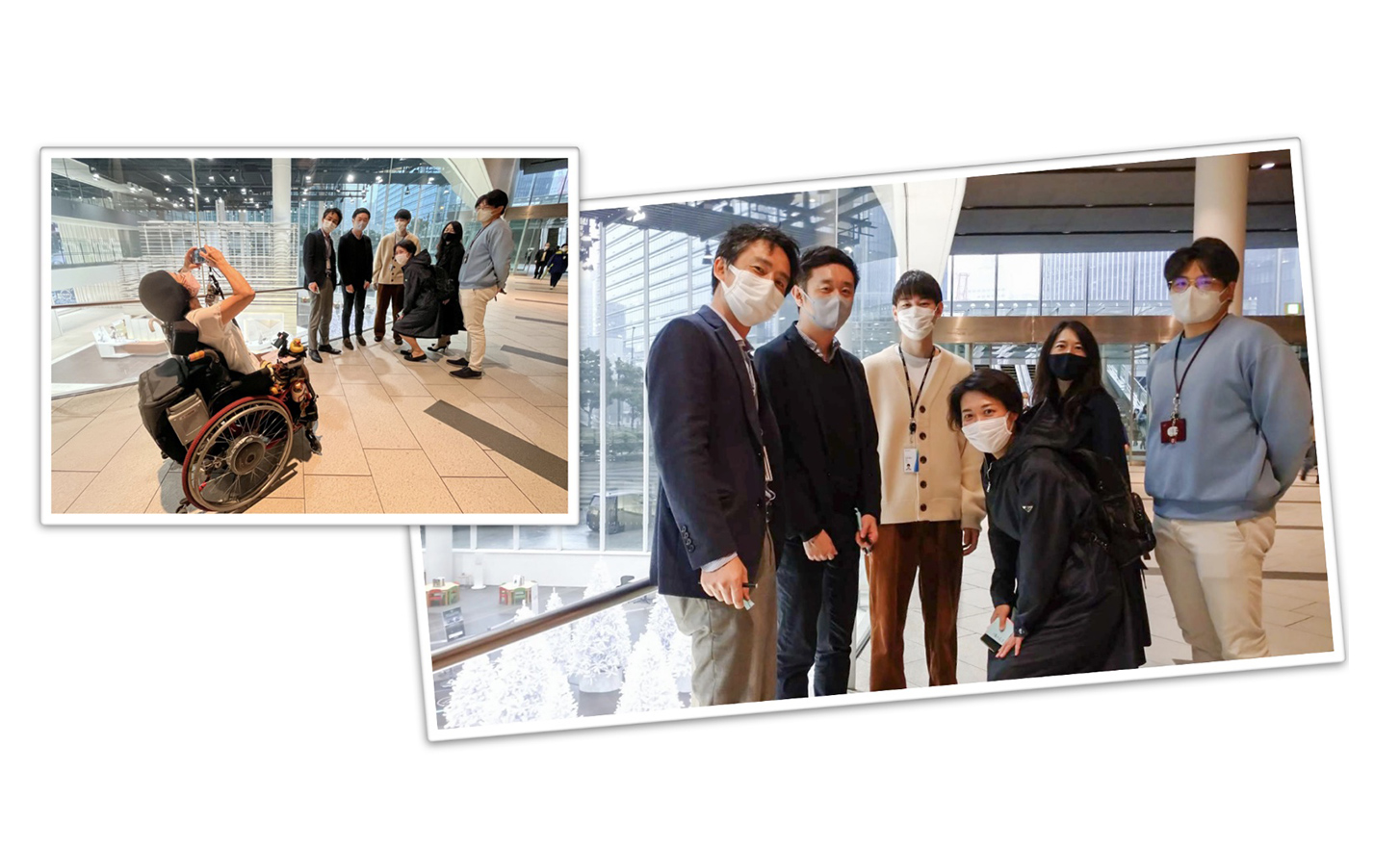
After an hour of fieldwork, one team after another returned to the office. Out of the four teams, only the team with Maito and Sabu successfully accomplished one of their fieldwork missions: to take a photo together by a Christmas tree.
Delving into lead user insight with emotion maps
It was time to move on to the next task in the workshop.
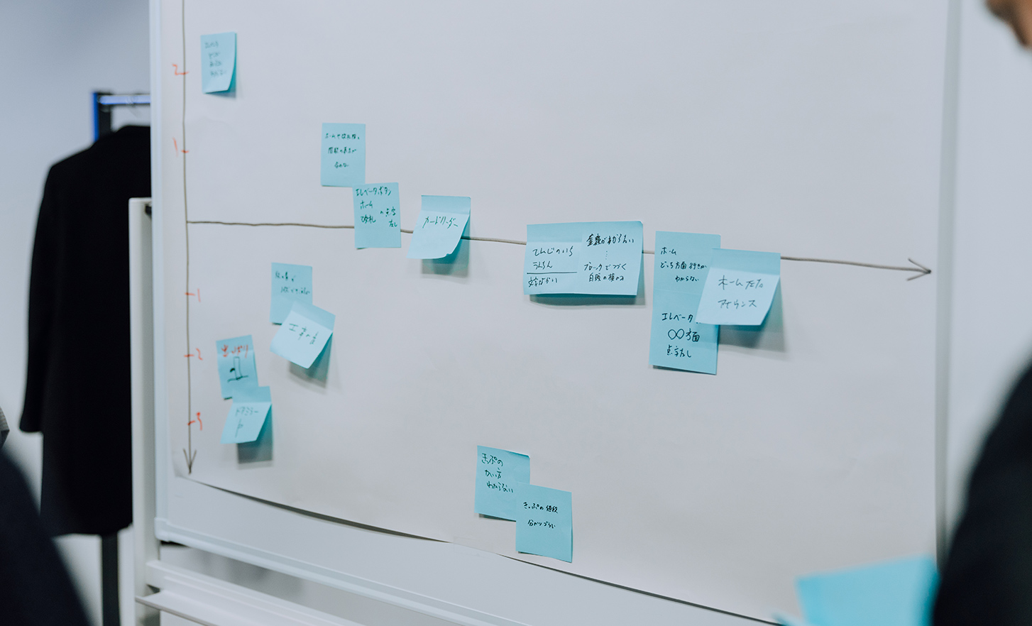
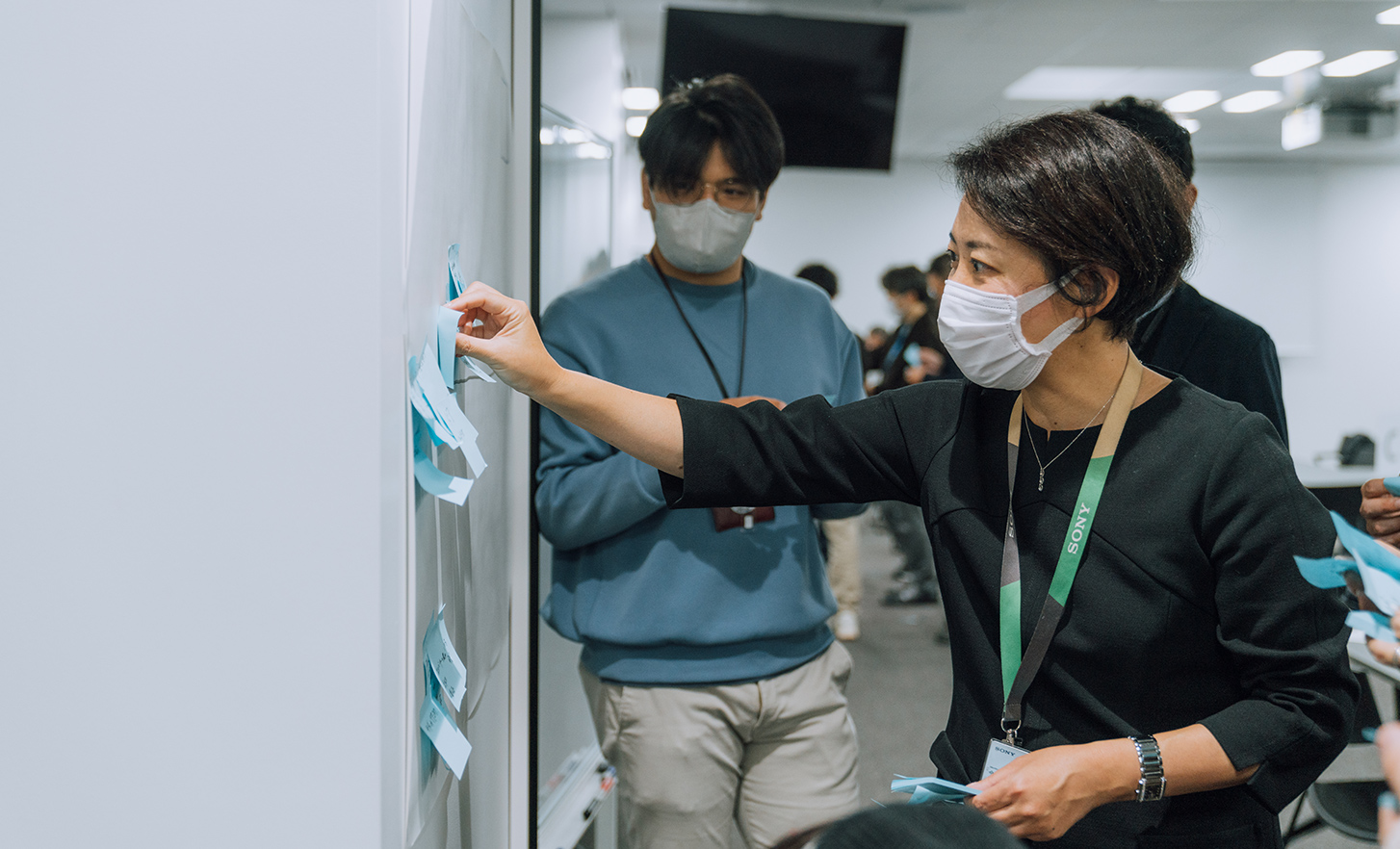
Team members contributed their sticky notes to create an "emotion map" chronicling their lead user's actions and feelings. How the lead user felt is plotted on the vertical axis ranging from minus 3 to plus 3. Situations causing positive emotions such as excitement are plotted higher on the map, whereas those associated with negative emotions such as stress or anxiety are plotted lower. The horizontal axis represents the time that had passed since the start of the fieldwork.
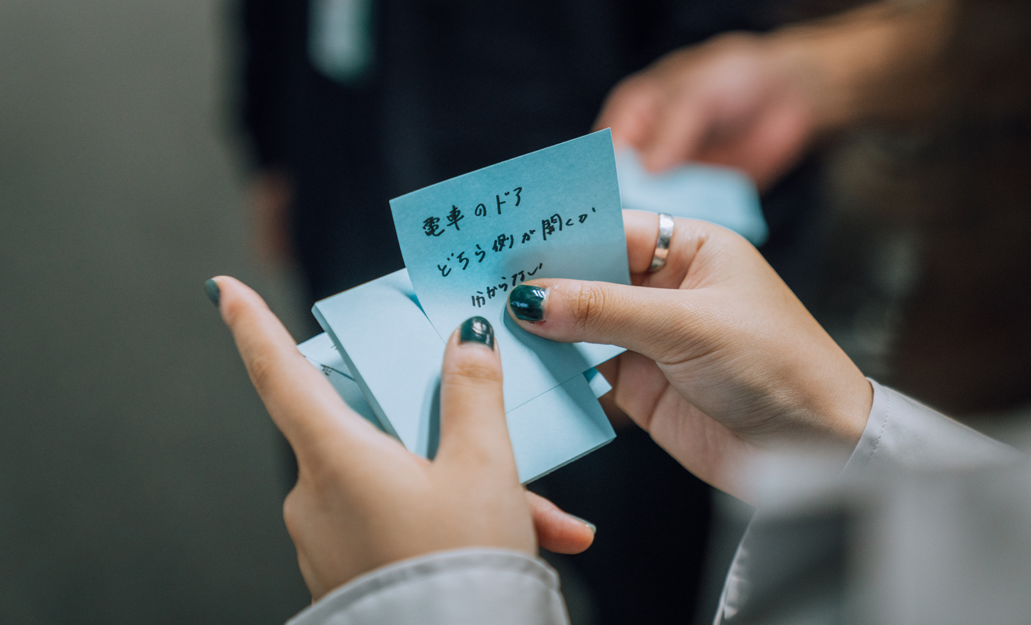
[Sony's employee]
The station was noisy, which made it difficult to hear the audio guidance for visitors with visual impairments.
[Sato]
That was fairly annoying, so I'd rate it –2.
[Rin]
In the station lift, there was no braille on the buttons to tell which floors the platforms and ticket gates were on.
[Sato]
I'd rate that +1.
[Rin]
Why is that?
[Sato]
Well, I'm sorry to say it, but that issue is fairly common.
[Rin]
How about when you were on a train that had arrived at your destination station but didn't know which side the doors would open on?
[Sato]
That's no problem, so leave it at +3. I can tell right away from the sound of the door opening.
Team members were surprised by how many positive situations there were. Sato said it was fun to guess correctly or figure these situations out, which showed some differences between their impressions.
Over time, those used to living in an inconvenient society come to expect inconveniences. And in some cases, lead users who revisit the emotion map also become aware of their own stereotypes.
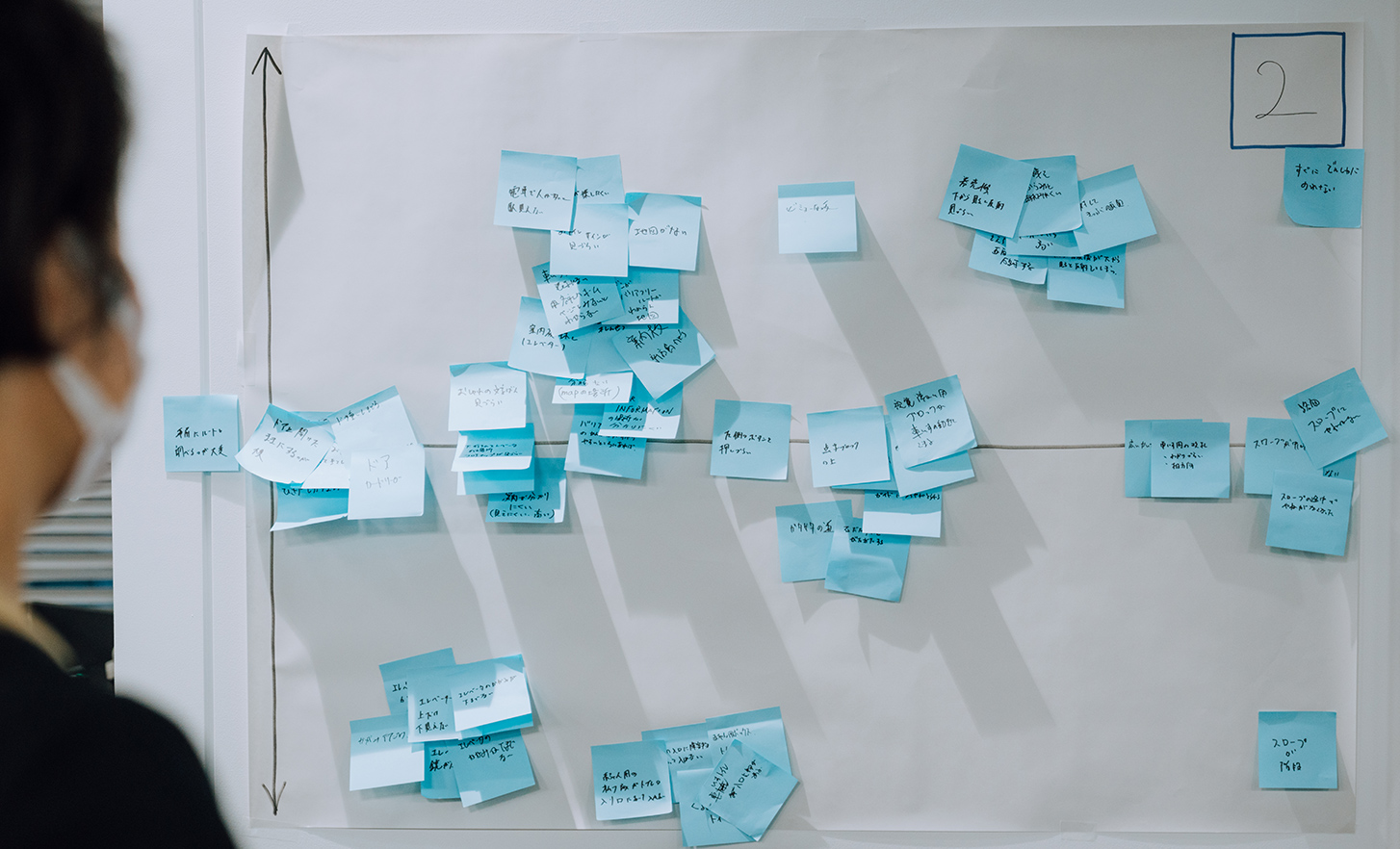
As team members empathise with lead users, social issues become clearer
Next, near the blue sticky notes, members other than lead users place pink sticky notes to indicate any similarly inconvenient experiences.
At the inclusive design workshops, this step—recognising that the issues are also personal—is especially important.
For example, an inconvenience on the sticky note of a lead user who walks with a cane might point out the difficulty of using a cane while holding a smartphone and also having to hold an umbrella on rainy days. Being able to operate the phone with one hand would be convenient.
As other team members read the blue sticky notes of lead users, they are asked to reflect on any similar experiences of their own. The inconvenience might seem familiar if, while travelling on business, the team members were using a navigation app on a phone while pulling a carry-on when it suddenly started raining. Those who remember similar experiences post pink sticky notes as fast as they can.
By recognising that they share the needs of lead users, other team members can consider the issue even more abstractly. They realise there are many issues that everyone feels similarly inconvenienced by.
Clusters of negative blue and pink sticky notes indicate situations where many people feel inconvenienced. These are areas where latent challenges exist for society as a whole.
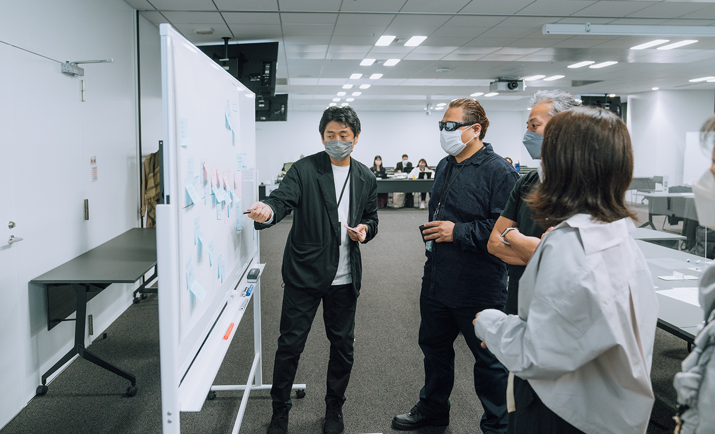
The workshop was finally coming to an end. Towards the goal of designing mobility for 2030 that everyone can enjoy, the teams discussed and defined mobility issues (defining the problems).
From these perspectives, each member illustrated ideas addressing social issues, with lead user inconveniences treated as shared issues.
The time for these exercises was limited to 2–3 minutes to stimulate right-brain thinking and spark inspiration.
Each member's ideas were then combined to form a consensus announced by their team, with each of the four teams then presenting their own unique solutions to these social issues.
How did the workshop turn out? In part 2, Sato, Rin and Sabu look back on their time together.
[Product examples incorporating inclusive design]
Sony and WS Audiology Denmark A/S (WS Audiology) have entered into a partnership agreement for joint development and supply of products and services in the over-the-counter (OTC) hearing aid business. Details are available here.
Sony has developed a new remote control 1 for 2022 TVs with feedback from user surveys and usability tests. Direct user communication assured the designers that the remote is comfortable for many people to use. Details are available here.
*1 Not available in Japan. Elsewhere, the remote is included with Z9K, A95K series, and X95K series (Europe only) televisions.
Text: Airi Tanabe Photography: Kiara Iizuka
[Accessibility] [#Creativity] [#Technology]


