Listening to music on premium audio products is a treat. To tempt a wider audience, we have developed a new design language.
Casual MP3 or AAC listening is now very common, fueled by the rise of smartphones and mobile devices, as fewer seek out the fidelity of high-resolution audio. We want more people to hear what they’ve been missing, in listening experiences that leave CDs behind – especially now that advances in digital audio have turned up the quantity and quality in streaming and distribution. Meanwhile, the fact that wireless listening is more popular shows that people also crave simplicity and convenience. The time was right to take a fresh look at what makes premium audio premium and develop a new design language for today and tomorrow, to convey what sets this listening experience apart.
What do people look for in premium audio design? We asked audio professionals and audiophiles through research and workshops in Tokyo and London. Revisiting audiophile aesthetics reminded us how important it is to reassure listeners about audio excellence, show its technical basis, and suggest high resolution through product appearance and materials. Rather than looking slim, light and futuristic, the superior product design we sought would inspire confidence by being solid and substantial.
Compression, condensing, and negative space
Considering what makes a premium, high-resolution listening experience possible led us to admire how things look when they are compressed and condensed. Imagine compacting all the elements of an audio product into a single, solid mass – compressing them until the materials are fused together, and what naturally remains is what’s most essential. Inevitably, this process reveals the negative space created as these essential features are preserved. Along these lines, we decided to focus on designing this resulting space, which accentuates what makes premium audio premium.
What’s the ideal negative space to frame each kind of audio product? Three pairs of concepts guided our thinking. The shapes that emerged from this process of compression would be simple and iconic. The audio products would also look reassuringly solid and durable. And fine-grained finishes and textures would recall high-resolution music by looking precise and conveying a sense of high density.
Takuma, chief art director
There’s a general trend toward minimalist design, but premium audio aspires to different ideals. In design, these products should tell you a little about the features and engineering that support this level of audio performance. Hi-res music preserves detail that is normally lost, producing sound with resolution and substance. We should take the same approach in design. Rather than eliminating one element after another, we should seek shapes reminiscent of inherent quality, presented as elegantly as possible.
Pure high fidelity, condensed
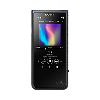
NW-ZX2
Pick up a Walkman® NW-ZX2, and you’ll see that we didn’t try to conceal the amplifier block inside. Instead, while the rest of the body seems compressed, you’ll notice a slight protrusion on the back where the amp is. It’s a distinctive shape and a reminder of what it takes to produce superior sound. Buttons are inset, with the negative space formed here making it clear by touch alone where the buttons are. Other signs of design supporting audio performance are the curved sides of the aluminum frame, which impart greater rigidity. The shot-blasted finish may remind you of high resolution. And when you set the player down, you’ll see how the cradle holds it high enough to easily insert larger, high-quality plugs, thanks to the carefully designed space left there.
Interfaces neatly enclosed
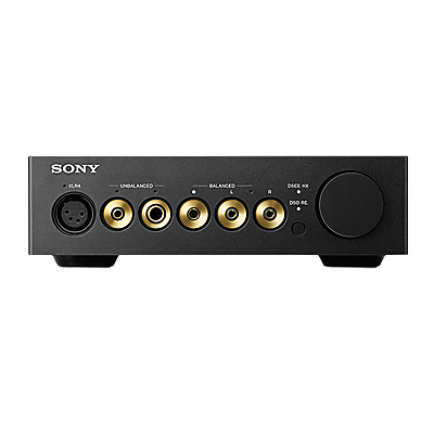
PHA-3
Unlike previous headphone amp design, with the interface and control guards seemingly added as an external feature, the PHA-3 incorporates all needed components in a solid, efficient body that shows traces of these essential aspects. In condensing these features, we integrated the guards into the body, which also defines a space for the dial and headphone jacks. Screws are carefully concealed, which makes the sleek body even more coherent. Constructed of milled aluminum, and enhanced by blasting. At a touch, you’ll also feel the quality of the finely ridged volume dial.
Yashiro, designer
It’s important that the shapes premium audio products take reflect their higher standards in sound quality. For us, the space left after preserving features that determine audio quality and the listening experience represents negative space. That’s how the outside took shape, as we looked inward, and it’s all linked to the exceptional purity of sound and the listening experience.
Getting a groove on,
from dual drivers
XBA-Z5
XBA-Z5 in-ear headphones introduce dual balanced armature units for clearer mids and highs, paired with a large dynamic driver. Here, negative space in design takes the form of a groove between them, which we ventured to leave untouched in the process of bringing features together into a single, solid mass. Visually, it hints that the earbuds house two units that are essential to their superb audio performance. The housing itself is constructed of highly rigid magnesium, with a fine-grained texture recalling high resolution.
Housings that reflect high performance
MDR-Z7
Generous 70 mm drivers in MDR-Z7 headphones create a plane wave effect, for more natural-sounding music. They’re also tilted toward the ear, enabling more uniform distribution over a broad frequency range. The shape of these essential, high-performance drivers is echoed in the housing, a detail that we retained in our process of condensing the housing as much as possible without compromising performance. Here, too, the fine finish suggests their fine audio quality. Housings are held by arms of aluminum, ensuring strength while enabling slimness.
Kurihara, designer
Although we took the approach of condensing, compressing, and preserving in design, some product features are more important than others. What we should emphasize – features affecting audio quality, appearance, usability, and so on – varies by product. By designing the negative space of open areas, we can make it clear what’s most vital and worthy of note.
Woofer-centered design
that looks like how it sounds
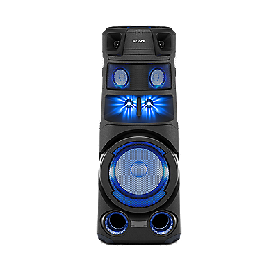
MHC-V7D/SHAKE-X7D
Negative Space aesthetics also inspire the design of exciting non hi-res home audio systems that are the life of the party, such as MHC-V7D / SHAKE-X7D systems. Here, we focused on the woofer, which symbolizes massive sound. By varying the space between it and the surrounding mids and tweeters – grooves that emerged as we compressed each speaker into a more solid arrangement – we gave the system greater impact and emphasized certain features in particular.
From the side, the system forms an elegant silhouette, with smooth surfaces. A hint of tension in these surfaces makes it seem as if there’s powerful sound pressure concentrated inside. Parallel surfaces are also minimized, which improves acoustics. On the top, controls lie flush, reflecting the same condensing in design, and making it easier to avoid contact when moving the system.
Morimoto, designer
Professionals and fans of premium audio want products they can rely on for years. That’s a good reason for the engineering behind this superior performance to be clear from product design. Nothing matters more to us than seeing these products sought out by people serious about music.
Sony Design
Pure Geometry
A symphony of audio-visual and interior elements. Discover inside stories on design inspiration.


